Maps
Are you good with data / GIS? Would you like to make some maps of your own? Please contact us!
To demonstrate the usefulness of Land Value Ratio, I’ve created a few maps of Austin. The first is a map of land values per acre. Only residential-only properties are shown, leaving large gaps in downtown and the University of Texas, but around these focal points are the most valuable, dark red plots.

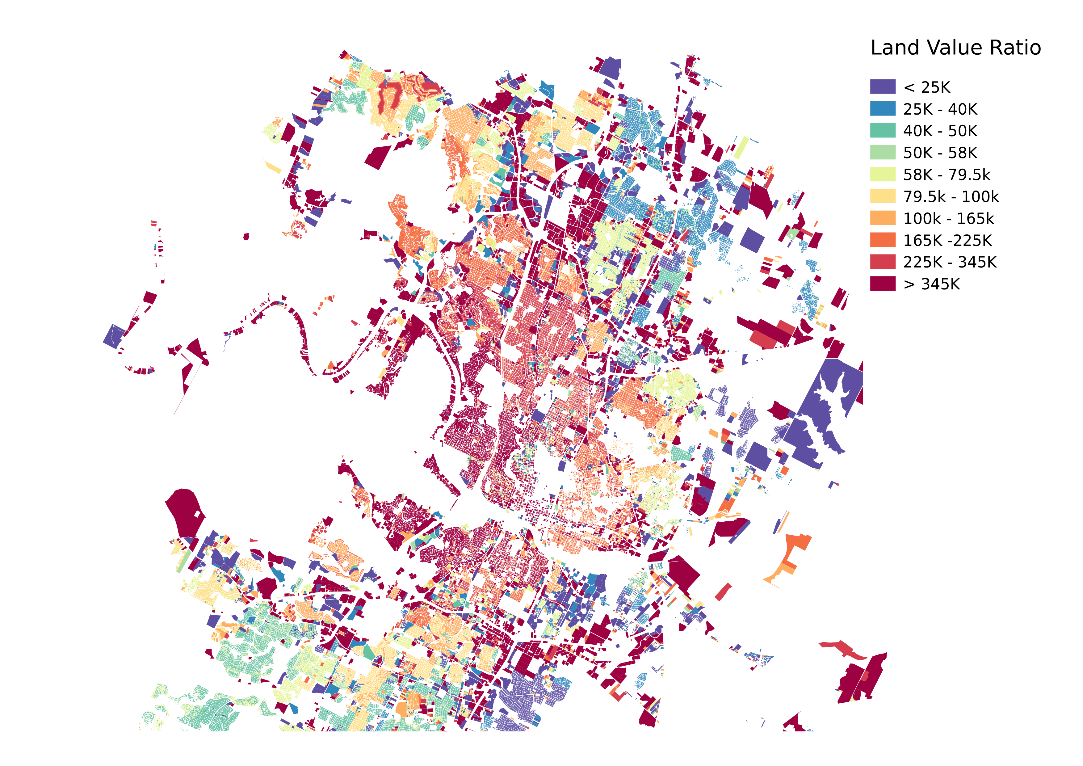
Next, we chart Land Value Ratio on a plot-by-plot basis. There’s a lot of noise in these charts, introduced both by the county’s tax assessment mechanisms and the fact that we are using the current number of units on the ground rather than the number of units that would be built if the project were built today.
Nevertheless, a fairly clear signal can be seen here of West and Central Austin as having significantly less units than price signals are telling us the market would support.
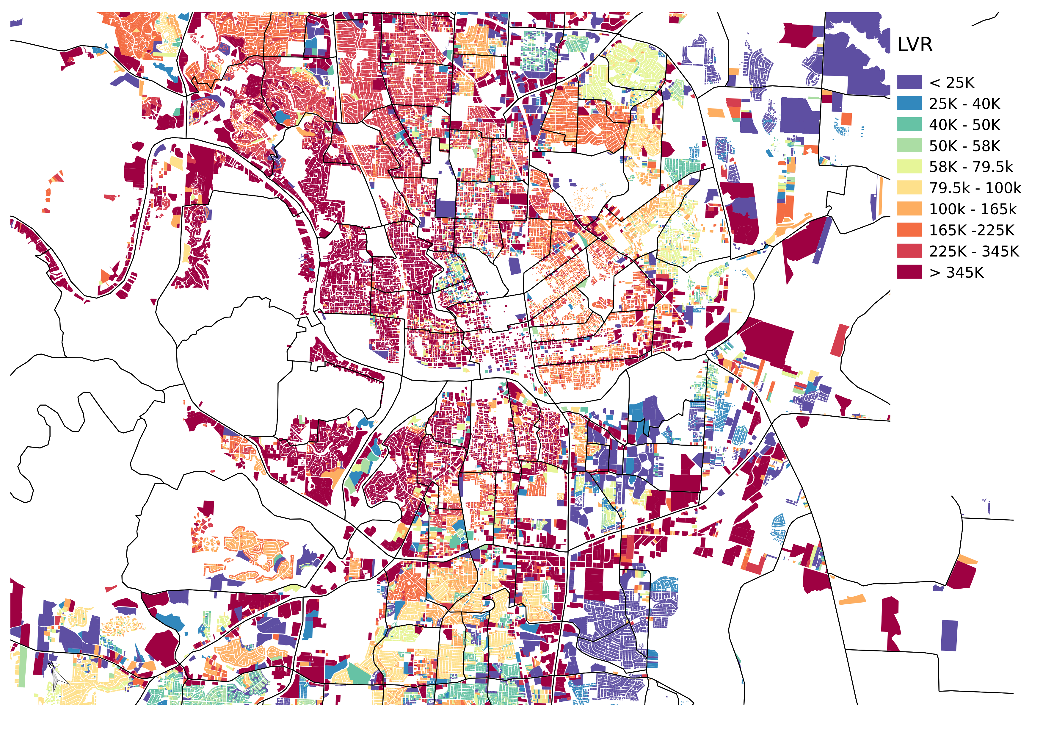
Below, we’ve zoomed in to central Austin. Next to the missing UT, you can see an interesting phenomenon! There is one neighborhood in central Austin with low land value ratios, West Campus. This student housing neighborhood has no less land value than its neighbor, but it was significantly upzoned in 2004, resulting in an immediate increase in mid-rise and hi-rise housing, predictable based on our understanding of land values and construction types.
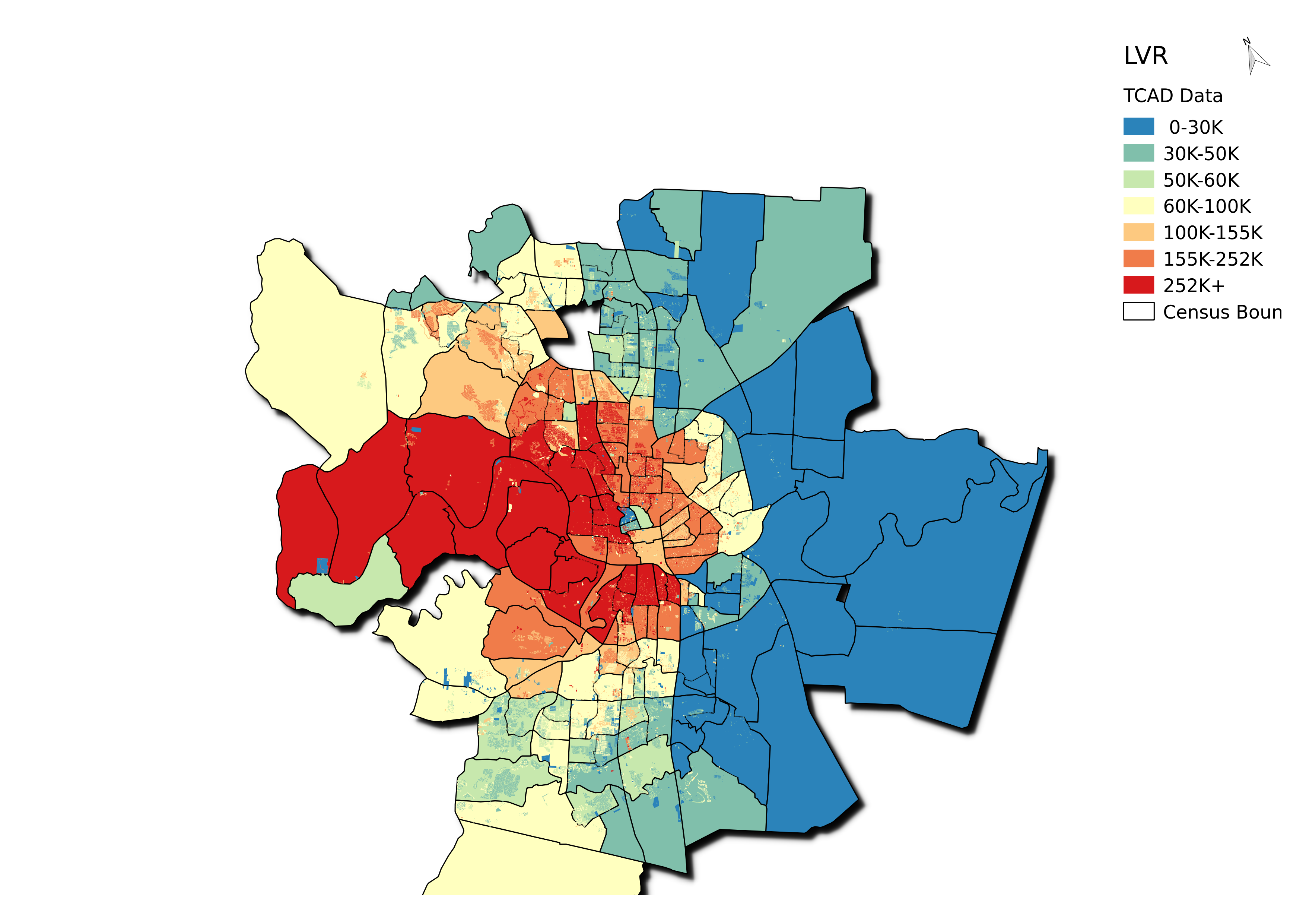
In this map, we have agglomerated census tracts into a single color. In this map, it becomes clear that West and Central Austin have high land values relative to their densities, with West Campus being a rare exception.

You must be logged in to post a comment.